Walk down any beverage aisle and you’ll witness one of the most intense battlegrounds in retail. Hundreds of products compete for attention in a matter of seconds, and the winner often isn’t determined by what’s inside the bottle—it’s decided by what customers see on the outside. The packaging choices beverage companies make can be the difference between a product that flies off shelves and one that gathers dust.
Most people don’t realize just how much their purchasing decisions are influenced by packaging details they barely consciously notice. The psychology behind these choices runs deep, and successful beverage brands have learned to master every element of their packaging strategy.
The Critical Role of Closures in Consumer Perception
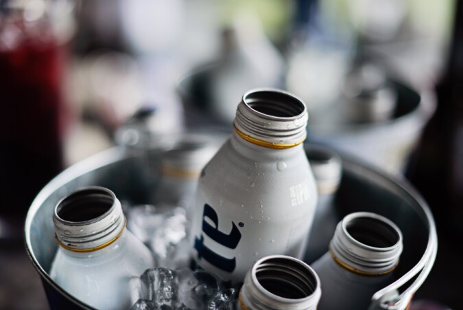
One of the most overlooked yet crucial packaging elements is the bottle closure itself. The type of cap or closure can instantly communicate quality, freshness, and brand positioning to potential customers. Many premium beverage companies have discovered that upgrading to higher-quality closures significantly impacts consumer perception, with options such as aluminum caps providing both functional benefits and an immediate quality signal that customers notice subconsciously.
The closure serves as the first physical interaction point between the consumer and the product. A cheap, flimsy cap can undermine even the highest-quality beverage inside, while a well-engineered closure reinforces premium positioning. This explains why craft breweries and artisanal beverage makers invest heavily in closure technology—they understand that the cap tells a story before the first sip is taken.
Color Psychology and Shelf Impact
Color choices in beverage packaging operate on both conscious and subconscious levels. Research consistently shows that certain color combinations can increase purchase likelihood by up to 85%. Red packaging often signals energy and excitement, making it popular for sports drinks and sodas. Green conveys naturalness and health, which explains its dominance in the organic and wellness beverage categories.
But color strategy goes beyond simple associations. Successful brands consider how their packaging will appear under different lighting conditions, from fluorescent store lighting to natural sunlight. They also factor in color contrast—how their product will stand out against competitors on crowded shelves. The most effective color strategies create instant recognition while communicating the intended brand message.
Shape and Functional Design Elements

Bottle and can shapes have evolved far beyond simple functionality. Unique shapes can become brand signatures that customers recognize from across a store. The distinctive curves of certain cola bottles or the angular design of energy drink cans serve as powerful brand identifiers that transcend traditional marketing.
However, shape decisions must balance visual appeal with practical considerations. Packaging that’s difficult to grip, stack, or store creates problems throughout the supply chain and at the consumer level. The most successful designs solve multiple challenges simultaneously—creating visual distinction while maintaining functionality and cost-effectiveness.
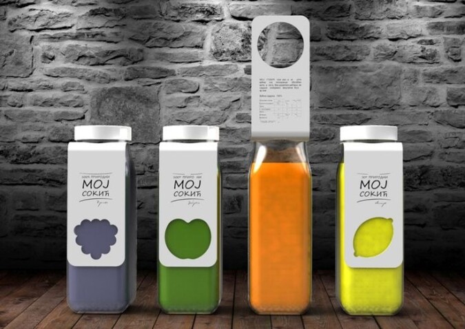
Container shapes also influence perceived value. Taller, thinner bottles often appear more premium than shorter, wider ones, even when containing the same volume. Square or hexagonal bottles can convey artisanal craftsmanship, while sleek cylindrical designs suggest modern sophistication.
Material Quality as a Purchase Driver

The materials used in beverage packaging communicate volumes about product quality before consumers even read the label. Glass bottles instantly elevate perception of contents, suggesting premium quality and superior taste preservation. However, glass comes with trade-offs in terms of weight, breakage risk, and cost.
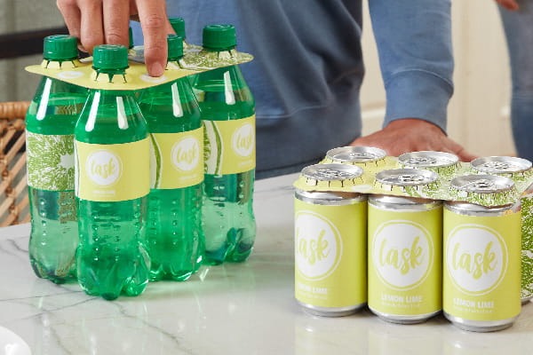
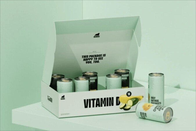
Aluminum cans have shed their budget image through innovative printing techniques and design approaches. Premium aluminum packaging now rivals glass in perceived quality while offering superior portability and sustainability benefits. The key lies in execution—high-quality printing, innovative textures, and thoughtful design can transform any material into a premium presentation.
Plastic packaging faces the biggest perception challenges but offers the most flexibility in terms of shape, color, and cost. Successful plastic packaging strategies often focus on functionality and convenience benefits while using design elements to overcome quality perception barriers.
Label Design and Information Hierarchy

The label serves as the primary communication vehicle between brand and consumer, but effective label design requires more than attractive graphics. Information hierarchy determines what customers notice first, second, and third. The most successful labels guide the eye through a deliberate sequence that highlights key selling points.
Typography choices significantly impact perception. Bold, simple fonts suggest confidence and clarity, while script fonts convey tradition and craftsmanship. The size relationships between different text elements create visual emphasis and guide attention to the most important information.
Sustainability Signals and Modern Values
Today’s consumers increasingly factor environmental considerations into purchasing decisions. Packaging that clearly communicates recyclability, reduced environmental impact, or sustainable sourcing can become a significant competitive advantage. However, these messages must be authentic and substantiated to avoid backlash.
The most effective sustainability messaging integrates environmental benefits into the overall brand story rather than treating them as separate selling points. This approach creates emotional connections that go beyond simple feature comparisons.
The Cumulative Effect of Packaging Decisions
Individual packaging elements rarely work in isolation. The most successful beverage packaging creates a cohesive experience where every element reinforces the intended brand message. Colors, shapes, materials, closures, and labels work together to create an immediate impression that either attracts or repels potential customers.
Understanding this interconnection helps explain why minor packaging changes can have major sales impacts. A single mismatched element can undermine an otherwise strong packaging strategy, while thoughtful coordination of all elements can elevate even simple products to premium status.
The beverage industry’s ongoing evolution continues to create new packaging opportunities and challenges. Success increasingly depends on understanding both the conscious and unconscious factors that drive consumer choice, then translating that understanding into packaging decisions that make products irresistible to their target audiences.

